What Is Responsive Web Design?
Basically, responsive website Design is ‘Serving Your Website on ALL Devices‘. Responsive is an approach to web design aimed at crafting sites to provide an optimal viewing experience—easy reading and navigation with a minimum of resizing, panning, and scrolling—across a wide range of devices (from desktop computer monitors to mobile phones.)
Google’s Matt Cutts provides a great, non-technical explanation: “Responsive design just means that the page works totally fine whether you access the website URL with a desktop browser or whether you access that website URL with mobile browser,” Cutts said. “Things will rescale, the page size will be taken into account.”
Why Responsive?
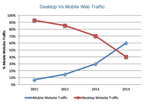
The use of mobile devices to surf the web is growing at an astronomical pace that is why there is this relatively new development to ensure optimisation for those mobile devices.
Mobile devices are often constrained by display size and require a different approach to how content is laid out on screen.
BENEFITS
- Responsive web design responds to the needs of the users and the devices they are using.
- The layout changes based on the size and capabilities of the device. For example, on a phone, users would see content shown in a single column view; a tablet might show the same content in two columns.
- Responsive web design also improves Search Engine Optimisation and highly recommended by GOOGLE.
- Convenient – Only one website needs to be updated and the changes take effect on the multiple devices accordingly. No separate website is created for a mobile site as previously sought out as a solution, a few years ago.